Chroma Keying: Tryouts With Jessica
| 6 imagesThis post is also available in:
Dutch
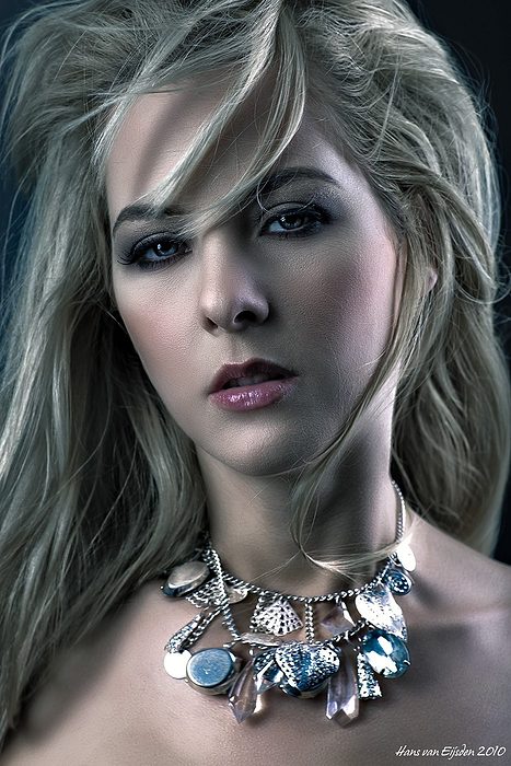
Chroma keying wasn’t new to me, but I used to work with a green background and old software. These images with Jessica are different. I decided to upgrade my chroma keying possibilities and add a blue background to my photo studio wall.
A blue background works better with my new chroma keying software and creates a better contrast with the light blonde hair of Jessica. The software makes a better cut-out and better, smoother transitions while it takes opacity in account.
To make these shots (not the last one though), I decided to use one simple light: my Elinchrom Deep Octa with grid. Not from the side, but… from the front. Because of the grid, it still accentuates the facial expression and creates a relatively high contrast.
In my post processing and imaging software I replaced the blue chroma keying background with some rendered clouds and other faux effects. This was easy, because I used some wind in the image which directs the attention to the movement and expression of the images in stead of the transition areas between the background and the actual subject: Jessica. 😉
I like these first time results, so the blue chroma keying background stays in my studio. I will use them for future projects, I like blue more than green.






Leave a Reply